FMI2QGIS
QGIS 3 plugin to download FMI-ENFUSER air quality data
FMI2QGIS demo site
This site has a collection of visualizations created as a part of the FMI2QGIS project. Click on links to view full versions.
24H ENFUSER air quality animation
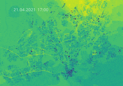
This short animation shows how air quality index (AQI) changes in 24 hours in Helsinki region. Brighter colors in the visualization indicate lower air quality. The data is a forecast. Impact of traffic can be clearly seen in the animation. This data is collected in one 24 hour period in April 2021.
Data: ENFUSER, loaded with FMI2QGIS
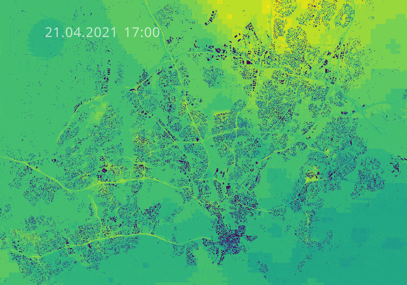
Average NO2 emissions in Helsinki
In this visualization user can view modelled nitrogen dioxide concentrations from 2019 in Helsinki region. Nitrogen dioxide mostly comes from traffic exhaust gases. Higher peaks and brighter colors indicate higher average emissions. User can pan and zoom around the map.
Click to open interactive 3D visualization of NO2 emissions in Helsinki region.
Data: HSY (2021): Annual air quality map
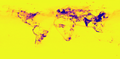
Global PM 2.5 pollution
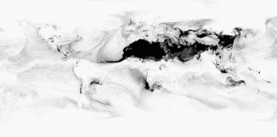
PM2.5 refers to atmospheric particulate matter that have a diameter of less than 2.5 micrometers. PM 2.5 can be dust, pollen or other fine particles which affect air quality. In the visualization darker shades of black indicate higher density of PM 2.5 pollution. Desert areas are clearly highlighted in the animation, which shows 5 day forecast in April 2021.
Data: SILAM Global Air Quality forecast
Global CO emissions
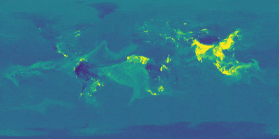
Carbon monoxide (CO) is produced in the incomplete combustion of carbon-containing fuels, such as gasoline, natural gas, oil, coal, and wood. Map clearly highlights the most densely populated areas around the world and brighter colors on the map indicate higher levels of CO emissions. The map shows a 5 day period in April 2021.
Data: SILAM Global Air Quality forecast
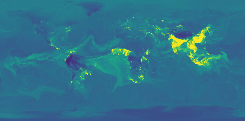
Global NO2 emissions
NO2 is produced when fossil fuels (coal, natural gas and so on) are burned. Darker colors on the map indicate higher levels of emissions in the forecast. The map shows a 5 day period in April 2021. Global shipping routes can be clearly seen from the animation. You can clearly see how time of day has a clear effect on the NO2 emission forecast as the color changes brighter from east to west in the animation.
Data: SILAM Global Air Quality forecast
Global SO2 emissions
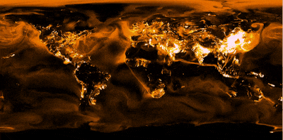
Looks like the world is on fire, but actually this map is showing similar emissions as the ones before. Also sulfur dioxide (SO2) originates from burning fossil fuels. Brighter colors on the map indicate higher levels of SO2 emissions in the SILAM forecast. The map shows a 5 day period in April 2021.
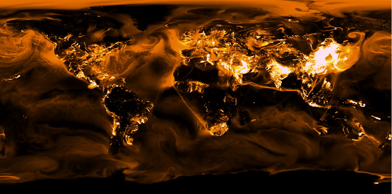
Data: SILAM Global Air Quality forecast
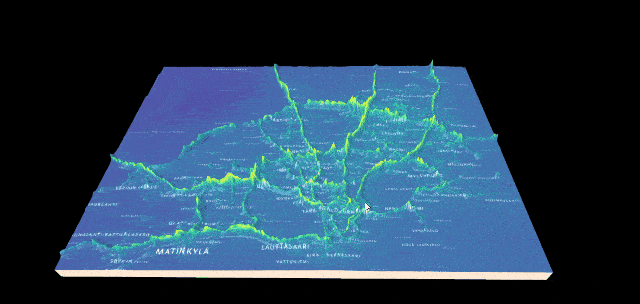
PM 2.5 pollution in Helsinki region in 3D

This rendering of annual (2019) PM 2.5 levels in Helsinki region shows an exaggerated three dimensional view. Higher peaks indicate higher level of pollution and main traffic corridors are clearly highlighted, especially in the full resolution version aims to give an overview of the conditions in the whole region.
Data: HSY (2021): Annual air quality map
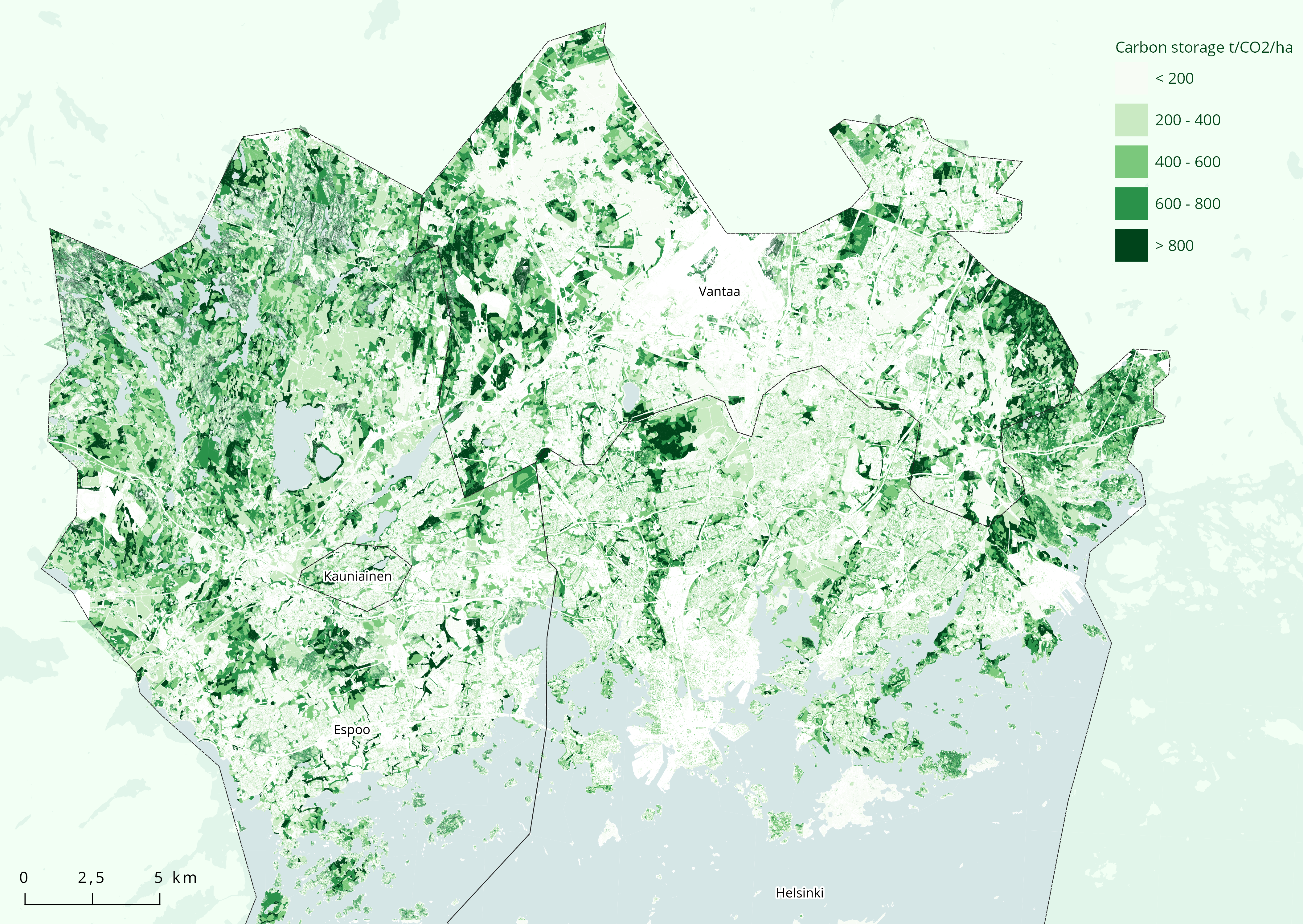
Carbon sinks in Helsinki region

A carbon sinks are reservoirs which accumulate and store some carbon-containing chemical compound. Carbon sinks have a connection to better air quality and this map visualizes carbon sinks in Helsinki region. Forest areas are clearly highlighted e.g. in Nuuksio in Espoo as well as Helsinki Central Park.
Data produced in 2020 and based on data collected originally in 2017.
Data: HSY (2021): Selvitys pääkaupunkiseudun hiilinieluista ja -varastoista